
New Kits Preview '06-'07
 The world truly has gone bizarro, now that The Sports Guy is a Tottenham fan and Real Madrid actually bought some (gasp!) defensive players, but we here on 116th Street can roll with the changes. If that means putting up with Simmons explaining to us how Robbie Keane is exactly like Manny, or Madridistas having fewer things to complain about (they still have Ronaldo, so it will only be a little less noise to tune out), we are ready.
This is why, in the spirit of change, we have to decided to get you all caught up on who's wearing what this season. Nothing could be more embarrassing that still rocking that "redcurrant" Arsenal shirt when everyone else is doing the "Fly Emirates" thing and proudly displaying their newfound red-and-white glow. Now, of course, about 3,478 teams changed kits this season, so there's no way we could keep up with all of the changes (if you really want to punish yourself, though, you can start by looking here). Instead, we will cover the famous clubs and the noteworthy changes, so that you're not taken by surpise when you see Chelsea and Liverpool in Adidas this year. Let's start with the Prem.
Manchester United, having spent the past two seasons trapped in a futuristic nightmare, has abandoned the whole "uneven faux-collar with strange sleeve-swoosh" look, in favor of a much more traditional appearance. The new kit, a one-year-only "special edition" (whatever, Nike), was designed to "honor" the "Busby Babes" of 1966, and takes many features from the United uniform of that era, resulting in a pretty classy, old-school look. Man U also gets a new sponsor this year (AIG replaces Vodafone), as well as a pretty snappy, white change shirt.
Chelsea certainly looked like a championship squad in their blue-and-gold outfits from last season, but now that they fancy themselves a "super-club," they have ditched Umbro in favor of the greener pastures (i.e., more lucrative dollars ) of Adidas. The resulting home shirt looks fairly pedestrian to the kit critics here on 116th Street, as the absence of gold accents makes this kit fairly basic.
Arsenal's special "Highbury farewell" shirts ("redcurrant" with gold lettering) may have been the sharpest of last season, but most fans seem ready to make a return to the bright red shirts with white sleeves that made the Gunners famous. The new kit is far from disappointing, as well; losing O2 as a sponsor only slightly diminishes from the kit's overall impact, as Emirates Airlines, with their snappy "Fly Emirates" slogan, picks up the slack. The new kits are bold yet traditional, and Arsenal will open their new Emirates Stadium in style wearing them.
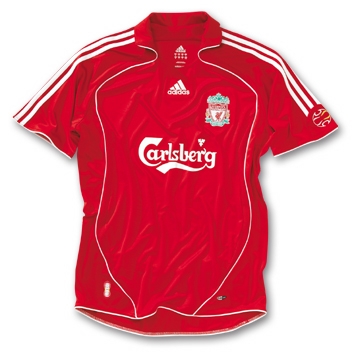
Adidas' buyout of Reebok means that Liverpool gets a new brand identity. The most recent edition of the famous red strip, last seen hoisting the European Cup in '05 and the FA Cup in '06, has been retired, making way for a new Adidas shirt that doesn't deviate too much from the script (Adidas did manage to add a collar, though, and the three stripes look pretty cool on this shirt). The Reds figure to sell a lot of these. Liverpool has also added a yellow change shirt, and a cool white-and-midnight-green shirt for Champions League away games. Elsewhere in the Premiership, Tottenham has ditched their smiley-faced cycling shirt for a tougher-looking white shirt (Simmons will love these), Manchester City got rid of their terrific sky blue shirts in favor of some not-terrific sky blue shirts, and Newcastle United has some pre-season numbering issues to resolve.
The Old Firm will be heating up once again in Scotland, with Celtic returning to defend their title in the same green-and-white "Hoops" that they wore last year, but with a new green-and-black change kit as well as a classy, white third. Rangers, on the other hand, seem to have given their cross-town rivals in green a bit of a slap in the face, debuting a new shirt with the flag of Scotland stitched into the shoulder (I thought these teams were trying to tone down the fan violence surrounding this rivalry; sectarianism - catch the fever!). Rangers have also added a fairly disjointed (yet brightly colored) change kit.
Over in Italy, the scandal has brought about the demise of still-stripy Juventus, and will keep us from getting a good look at those super-sweet new Lazio shirts, but Serie A still has some goodies left. AS Roma has ditched their futuristic monstrosities of last season, in favor of a retro look for Totti and company (still not a fan of the faux-collar look, though). Wannabe scudetto champs Inter make a fairly minor change, adding a white V-neck to their traditional stripes (we're not entirely sure it works, but it doesn't look bad, either). AC Milan, meanwhile, gets very slight gold piping and a new sponsor (Opel, you and your line of automobiles will be missed).
As usual, all of the best action is in Spain, where FC Barcelona has followed up last season's superior kit with yet another winner. Lots of nice touches here - check out the Catalan flag on the sleeve, and the "Mes que un Club" ("More than a Club") slogan on the inner collar, not to mention some super-snappy gold lettering on the back. Barca also ditched their highlighter-yellow away shirts from last year, in favor of a more mellow orange kit.
Archrivals Real Madrid, having gone with such a clean look these past few seasons, have added a few bells and whistles to this year's kits, and lets face the facts: these. kits. suck. Beyond the ugly silver piping, and the dopey number font (Real always seems to be so proud of their crappy numbers), wtf is up with that FIFA badge? It's supposed to celebrate Real Madrid as the team of the 20th Century, but the 20th Century has been over for nearly 8 years, so what's the point of that? At least they did better than Sevilla, who will wear 5 (that's right, 5!) different kits this season.
We need to wrap this up, all of this hyperlinking is making us fatigued. We'll do a Big Finish, PTI-style. FC Porto gets some ridiculously nice home and away kits, thanks to Nike. Valencia goes traditional, and so does PSV Eindhoven (very sharp!). Paris Saint-Germain and Olympique Lyon maintain the status quo, while Borussia Dortmund gets stripy (for no apparent reason, I might add). Blue finally makes a return to Bayern Munich, via their new change kit, and Monchengladbach gets a cool shirt. As for Ajax Amsterdam's new change strip... the less said about it, the better. Well, that's all for now, we here on 116th Street are exhausted (who knew a new kit preview would require so many links?). For those of you who are new to the game, and are unsure of where to look to pick up a fancy soccer shirt that will impress your friends, there are a couple of good links to the left (Subside and Kitbag, specifically).
posted by Zach | 1:22 PM
![]()
1 Comments:
God, those Real Madrid kits are atrocious. As a Chelsea supporter, I'm quite happy with the new kit. The gold piping has not been a tradtional feature of Chelsea's kits over the years and was only added for the centenary year in 2005. Last year's badge was also slightly different. Those Porto kits are very nice indeed!
Post a Comment
Subscribe to Post Comments [Atom]
<< Home